Propertyology is a leading Australian property market analyst, buyer's agent and long-term client of RGC. We were delighted when Managing Director Simon Pressley approached us to reinvigorate their website. The primary goals of the redesign were to improve user experience (UX) through design, establish authority, build trust, promote content and generate leads.
The existing Propertyology website was built on the capable Wordpress platform and features hundreds of articles for visitors and paying members alike. Given the site’s strong track record of serving upwards of 16,000 pageviews/month, a homepage redesign and navigation reskin was agreed upon.
1) IMPROVE UX
Simplicity is a key pillar of strong UX. We started by cutting down the 34 menu items to just 20, and condensed them into a hamburger menu to keep clutter to a minimum. Social media handles and a click-to-call button were allocated to the new top-bar to improve their visibility. To capture the reader’s attention immediately, a looping data visualisation video background was chosen to create an immersive experience that reflects their visual identity and deliver their message quickly and concisely. High impact images were chosen, utilising the brand’s colours and location specific photography to ensure the user’s visit was memorable and captivating. For example, sections with photograph backgrounds will never butt up against other photograph sections, and are always divided by a solid colour block.2) ESTABLISH AUTHORITY & BUILD TRUST
Authority and trust go hand-in-hand, establishing either requires some assistance from the other. Once the user’s trust is earned, conversions are sure to follow. Establishing Propertyology as an authority in their field is most notably expressed through the promotion of their earned media coverage. Logos of trusted, well-known media outlets that have featured their insights were the simplest and most effective way of promoting this and are positioned in the video header and as their own section further down. Simon is a key element of Propertyology's brand identity, so we chose to integrate a cutout photograph of him beside the first call to action form to introduce him to the reader and giving a human face to the Propertyology brand. Most will agree that customer testimonials are a necessity for social proof, but we contend that natively hosted reviews are often problematic. Recognising this, we created a section that leveraged Propertyology’s existing customer success articles which are backed up by tangible, relevant data.3) PROMOTE CONTENT
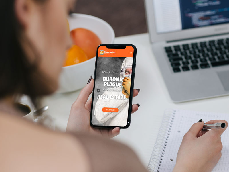
Content marketing is a key element of Propertyology’s brand and we strived to ensure this was communicated effectively. The latest news and insights articles are now the first item below the fold. This section partially overhangs the header video for depth, and encourages the user to scroll further. A large full screen feature article slider was created to promote popular posts and infographics. The best example of this is the Bubonic Plague article which garnered national media attention and nearly 4,000 pageviews alone.4) DRIVE LEADS
Ensuring there was minimal distance between visible calls-to-action is a deliberate measure taken to encourage users to convert while visually segmenting the page. This is reinforced by each form offering a different reward for successful submission, such as offering an eBook download. Consideration was also given to GDPR compliance, for transparency of data usage and improving mailing list quality.
Share
- Project URL
- propertyology.com.au
- Client
- Propertyology
- Release Date
- 2019
